I'm currently working on an "index" or documentation of 10 years of the Design Interactions Department (Royal College of Art) which I hope to finish soon (ie: before December). Much gratitude goes to Nina Pope who was the one who suggested it in the first place and allowed me to retrieve whatever flotsam and ephemera was left in the studio. I still have many people I want to write to and I confess that I originally meant to finish it by September, but it has taken me more time than expected and I am also now in Singapore working on other things. But since this is already coming after the graduation and there are no real deadlines except the one where I throw in the towel - I thought I should exercise due diligence, and do a little more digging into the wider history of design education as well as other courses which have since ceased to be, such as the Environmental Media course which was intrigued about some time back (but found not very much information about it online)...
I had never been to the Special Collections prior to this, nor was I particularly enthused about the College Library with its considerably short opening hours whilst I was studying (Imperial's library was very close by and I had access to it 24-hours). I suppose the thing is that I wanted a more general library at the time but the RCA Library collection does seem quite... idiosyncratic, as is likely to become the case with any modest-sized library of about 70,000+ books (in comparison with an extreme example, the British Library holds 170 million books). As a result, I've always felt that the RCA Library is more like a kind of place you wander into and encounter some pictures in an old book that you've never seen before - rather than a comprehensive place you could go to find any specific book in a university course reading list.
With the present difficulty of entering the college outside of term time without a pass (now becoming a real schlep with all the signing-ins, waiting to be collected, etc - despite ostensibly working on/for the college in some capacity!), I was determined to MAXIMISE MY LIBRARY EXPERIENCE! FIND ALL THE MATERIALS! SEE ALL THE BOOKS! And so scoured its lending shelves quite thoroughly for interesting, rare or antiquarian finds! (In this one respect, I recommend the very first section to the right on the ground floor. One usually might not think to go there as there are no books on the right wall which is the only wall you can see, but the left wall does hold what are probably some of the most expensive books which are hidden out of view. That one wall seems to be holding the bulk of the variously large and oversize books - where you will find gems such as an ORIGINAL 1904 edition of
Haeckel's Kunstformen der Natur).
Never did I think that one day I would actually read a book about the Royal College of Art from the context of a former student looking at its history. Several years ago, when I first entertained the thought of further studies, I began copying the statements issued by universities and departments to potential students into my wiki. Don't laugh, but I was so serious about applying to RCA that I actually pasted a statement from the RCA prospectus onto the front page of my wiki:
"The criteria for acceptance by the Royal College of Art are talent and potential, along with the commitment and the ambition to make a difference within an art or design discipline".
If this is the statement issued by the university to the student, then what is the equivalent of the statement issued by the monarch to the institution which seeks to be a royal university? I mean, what makes the college so "royal"? There is in fact the Royal Charter that the RCA received in 1967 which made it a university (which I must admit I had not read before):
Royal Charter: Our objectives are 'to advance learning, knowledge and professional competence particularly in the fields of fine arts, in the principles and practice of art and design in their relation to industrial and commercial processes and social developments and other subjects relating thereto, through teaching, research and collaboration with industry and commerce’.
Emphasis above is mine, but what is interesting is the repeated mention of industry and commerce in the charter. No such mention of industry and commerce is in the call to students, but I suppose the state of industry and commerce in the country is less the prerogative of the individual student and more that of those who are steering the college.
In former Rector Christopher Frayling's book on the History of the Royal College of Art, Frayling writes that "it was clear in late 1970s that college was becoming test-case
pour encourager les autres" - with the Undersecretary for Higher Education threatening that it might receive "less recurrent grant" in the future if the RCA did not respond enough to National needs and priorities as per its Royal Charter. In Spring 1981 a visiting committee also reported that although the RCA may be "thriving", "it was neglecting its duty enshrined in Royal Charter" by not having enough links to industry and not making the revitalisation of the British economy its ultimate priority.
In a way I feel like the dissolution of avant-garde courses such as Environmental Media in the mid 1980s foreshadows that of the present day situation. Of course, these are two different situations, but the point to be made of both is that there has always posed a great difficulty in quantifying the value of art and design education. I suppose this is why a design school prospectus is always sure to have lists of graduates who have made it big in the industry or with their own commercial success stories or commercial companies. And an art school prospectus is going to write of the big international museums, fairs, and prestigious galleries their graduates have gone on to show and sell work at. How else do you quantify success? With significant HEFCE education funding cuts in the UK, the pressure is definitely on to "prove" that funding education is still a good investment.
For example, the strategic plan 2010-2016 by current Rector Paul Thompson stated outright a goal of "Expand(ing) the programme of Master’s courses to advance new developments in design and art, ensuring twenty-first century relevance". As to the metric used to determine the success of this particular goal, the intended outcome was to be "a 50% increase in student numbers to approximately 1,500 by October 2014; this will be caused by additional recruitment to existing courses, combined with recruitment to new courses that have been successfully validated". Strategic plan 2016-2021 envisions four new research centres and ten new postgraduate taught programmes and the student body will consequently have increased to between 2,300–3,000 by 2021. [You can read the strategic plans here on the
list of RCA's Corporate Publications]
Personally I would have expected "increase in student body" to have been classed under "
Finance" goals from the beginning - instead of under the goal of "
Relevance"; it comes across a little disingenuous when phrased as such. Only 5 years away and an expected 200% increase in the student body from 2011? I really don't see how massive increases in student numbers will directly ensure twenty-first century relevance; it will instead increase the college's income from tuition fees and reduce its dependence on HEFCE funding - which is a perfectly legitimate goal for the college.
Also, I find it problematic when I see statements like "unified, customer-focused approach to the delivery of academic and operational services" and "value-for-money" bandied about. Is this how one must write or speak in order to be understood by funding bodies? But what happened to the human poetry of intellectual curiosity that should be the foremost driving factor behind art and design research excellence today? I'm not really comfortable seeing a document that is being disseminated to students and stakeholders entirely wrapped up in jargon that may not be universally understood.
And it is not just this issue of quantifying value, which we see when a document is expressed entirely in business jargon. To speak of terminologies, I suppose the bottom line of programmes like Environmental Media and Design Interactions was to some extent, an insistence on
ambiguity. Ambiguity in its materiality in the former, and ambiguity through its materiality in the latter.
An account from Frayling's "The Royal College of Art: 150 Years of Art and Design": "One reason why conceptualism, minimalism and performance art never developed solid roots within the existing Fine Art schools was that from 1975 onwards, the Department of Environmental Media had been created to teach the more avant-garde students who were emerging from post-Coldstream painting, Sculpture, and Film courses. This catch-all Department started life as "the Light Transmission and Projection unit" under Bob Hyde, rather uneasily sharing studios with Hugh Casson's interior designers. But as the unit came of age - and in particular, as it proved to be more expensive than anticipated, with increasing use of video (or rather "time-based media") - no one seemed to be sure whether it had more in common with Stained Glass (coloured light) or Sculpture (spatial art)."
[...] "In which case," yelled the Glaswegian, "you're like a surrealist painter trying to paint a picture of someone trying to paint a picture of someone trying to paint a picture of someone trying to paint a picture... If you're not a dialectical materialist you're not in the picture at all." At that point he stormed out of the room, muttering about the secret police."
At Design Interactions, the goal as I understand it, was that tutors were trying to guide us towards the production of a work that might only be partially contextualised within our world, presenting itself ambiguously as a physical object from another world within our world, simultaneously juxtaposing multiple 'realities' but crucially never allowing total escape from remembering that we are still from our own reality. Doing so would allow the work to transcend plain commentary into something more uncanny? More perturbing? Something supposedly more effective in stimulating the audience into a deeper engagement with the work and issues at hand.
The issue of ambiguity lies not only in the reception of the work but also each individual artist/designer/technologist who produces the work. How confusing that must be for anyone working OUTSIDE of the discipline looking at it, especially if the confusion arises for those trying to determine an institutionalised metric for calculating the efficacy of the works. Equally confusing it must be for artists or designers with a more malleable 'voice' - it is certainly not for all. My issue with the production of works (particularly in the case of student works, if I may be honest) was that sometimes as an outside viewer I simply could not read what the designer/artist's intentions were. Whether a work is capable of concealing and revealing its position at the same time may be dependent entirely on the viewer's common knowledge and shared understandings with the producer of the work, so the onus would be entirely on the viewer whom the author has no control over. In a sense then, the work doesn't really end until you see what comes out from the other end (ie: the engagement of the viewer), leaving us with the problem of the black box that we have yet to unpack...
As this is getting quite long, I'm going to stop here for now and move on to... an anecdote about another black box!
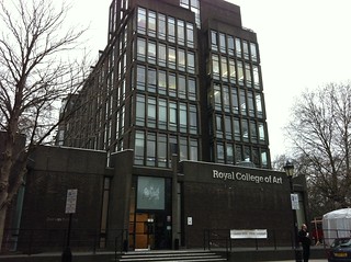
Why is the Royal College of Art black?
It never occurred to me to google for a picture of the architecture of the school until I first personally visited it for an open day, but knowing on paper that it was in the grand old Albertopolis area with a long history with the South Kensington Museum, I actually expected it to be less... harsh and BLACK. One might imagine that this was meant to make the building stand out in the area - however, it appears the truth is actually quite the opposite!
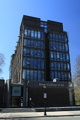
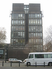
Images found on flickr by Chmee2, typeoneerror and Vicky Teinaki
The Darwin Building (Grade II listed) was designed in 1961, some years after the great Smog of 1952, which purportedly contributed to the demise of up to 4000 Londoners. This was also just before the Clean Air Acts of 1956 and 1968 banning black smoke emissions and requiring urban residents and factory operators to use smokeless fuels. Even in 1962 there was a significant fog which killed around 750 Londoners due to the extreme levels of pollution caused by black smoke (burning of coal, etc).
So in the 60s, the other buildings in the area such as the Albert Hall and the V&A Museum's terracotta design would have been covered in decades of thick black soot. Therefore, the RCA had been specially designed to have a "black brick and black concrete fondus" (both of which were rather expensive at the time) to suit the fabric of Albertopolis!
The entry on Historic England (the public body tasked with preserving and listing historic buildings/monuments) also makes this clear: "Reinforced concrete clad in dark red-brown brick intended to complement Norman Shaw's Albert Hall Mansions, then uncleaned, on the other flank of the Royal Albert Hall." In appearance, it is so dark as to appear black or grey from certain angles.
A couple years after its construction, London decided to clean up in the 1970s, perversely leaving the Darwin Building as the only outstanding sooty black building in Kensington Gore...