Saturday, 31 October 2020

I self-studied for 6 and a half hours to pass the Unity Certification (Unity Certified Associate: Game Developer)

I just did the Unity Certified Associate Game Developer exam and passed it. Aight, I know this is probably going to sound like a HUMBLEBRAG but, I am writing this post because I was originally pretty apprehensive about taking the exam. Although I’ve used Unity for several years, I wouldn’t describe my job role as a game developer. So I worried that what I had done before wasn't good or "professional" enough. Before the exam, I also furiously googled for people's accounts of how they studied for it, what exactly they studied, so in case there are others who come after me who are doing the same thing, I thought I'd add a description of my experience and what I did to pass!

I know that the Unity Certified Associate is considered the "entry-level" certification, but even if its the entry-level test, it still needs some studying! Besides my artistic endeavours (which this blog is mainly about) I actually work a full-time job (and not as a game developer), but Unity happens to be something that my work would like me to focus on a bit more. But it is actually a very intense few weeks at work – in addition to which I am also having to care for a very demanding toddler + working on several personal projects on weekends, so this meant I was very busy and only really able to eke out a little bit of time for studying.

Now, the title of this post is a little click-baity, but it is true. Recently it so happened that I re-installed Rescuetime, so I am able to definitively tell you exactly how long I spent preparing and "studying" for the exam from start to finish!! No more handwaving or vague estimations, I can actually tell you that in total, I spent exactly:

38.5 hours preparing for the Unity exam:


32 hrs (8 hrs x 4) : Attending a Unity Game Developer course
6.5 hrs : Self-studying

Breakdown of Course time

32 hrs: Attending a Game Developer course. I decided to sign up for and attend a course with fixed hours and a human instructor so it would formally "block" out time in my calendar to study Unity. I could have done it online on Udemy or Coursera or something like that, but attending it with real people also gave me the pressure that I had to finish the course, and I also could hear the sort of questions that new users ask (useful for someone who intends to teach it). Since it was formalised as a course I had to attend for 4 weekends, I asked my parents to help with childcare (thanks mom and dad!!!) during my course hours, so I could really dedicate the time to studying Unity and asking the instructor all the questions I ever had about Unity. I should add that at the point I took the course, I had several years of experience of casually using Unity already, so the material was generally very simple for me but I really appreciated having someone tell me what was the OFFICIAL way to do things. I've been anyhowly doing things for a long while (because I was self-taught but in a very disorganised way) and the instructor Siang Leng showed me many quick fixes for things I had been doing in very weird ways, so this was very enlightening to me.

For me, my intention when I take a course like this is to eventually reach the level that I could teach the subject, to be able to explain in detail the semantics of the user interface of the program, to understand everything about how the formats are encoded and used, and for me to I fully understand the processes from start to finish and do it in my own way, instead of just copying what the instructor is doing. I like to think that my capture rate (rate in which I absorb what instructor says) is very high, if not 100% at this point. Once I am shown how to do something, I will go and make sure I can do the task myself, and I will screenshot or even make a screen video of myself doing the task on my own after the instructor does a demo, and I immediately publish this to my own wiki (my 'Second Brain'. In forcing myself to document everything this way (to be able to use my own demo to teach others), I am pretty sure that I... have more than accomplished the "lesson objectives".

Breakdown of Self-Study time (6.5 hrs)

3.5 hr : Completing all the quizzes on the official Unity Courseware. When I did the course, I was given access to the official unity courseware on gmetrix. Now this courseware is the one for the "zombietoys" project that I vaguely remember trying out yeaaaaaaars ago when I first started using Unity. Not that I ever completed it. A lot of it seems very outdated, as it was done on Unity 5.something. But I decided to do the quizzes at the end of each section. If I got a section mostly wrong, then I went back to watch the video for it (at 2x speed, of course). I think I breezed through the first 10 chapters without getting quizzes wrong, then the second half was the stuff I clearly wasn't so familiar with, things like Animation and Audio.


3 hrs :  Mock exams. I had access to a special 400+ mock exam question bank prepared by my course provider, like a kind of "ten year series". To be honest, I didn't have that much time, but at the barest minimum I decided that I would go through every single mock question once. I checked each question as I did it with the answer key. I did some of this whilst breastfeeding Beano with a split screen on my phone, however, I quickly realised that studying on my phone wasn't the most ideal for certain sections because I really ought to have just done it with Unity open in front of me.

As I went along, I googled each section on the Unity Manual, googled any words I didn't understand, opened up Unity and used the feature to build a test file. In Unity, I created every single possible asset once, created every 2d and 3d component once. I made handwritten notes as I went along, and later I also 'revised' from these notes by highlighting key words.

I asked my colleague (Unity guru!!!) for areas he thought I should revise and he mentioned a few areas that I realised I was less familiar with - Animation, Audio, etc. So I tried going through the motions of creating the animator, setting up some audio mixer groups, trying out every single type of light with all the different shadow settings, making different particles, etc.

I am glad to say that the outcome was, better than random! 644/700 means that I should have scored about 92/100, so yeah, I'm happy with that score. It was on the whole easier than I had expected, but I might have been lucky with the draw of the questions. I recognised several of the questions and topics from the official courseware / mock tests. The time (90min) was more than enough, I sped through it once and finished it within 40 minutes, marking all the questions I was not sure about for review and then I used the remainder of the time to check the 'mark for review' question set twice through, unflagging them as I made up my mind about the answers. Then after having checked it as best I could, I decided I would submit it (20 min early). (I was very glad to have done it on computer instead of at a test centre which would probably have given me a lot of nerves).

So what does this mean? It means that it is true that the exam is more about your experience and familiarity with the software and scripting. If you are a casual Unity user of several years, it is possible to pass the Associate exam (not professional exam) with basically what is just around 2-3 evenings worth of extra studying (6.5hrs) on top of completing a basic game dev refresher course (32 hrs).

I hope this helps someone else out there trying to decide if they should take the Unity exam and how to study for the Unity exam!

Many thanks to the Dingparents whose help made it possible for me to study for and ace the exam!!

Sunday, 23 August 2020

My First Vinyl Cutting Project

I've always liked vinyl as a material since the process of labelling and thinking about the text has always felt like a meaningful part of my work. Sometime back I also enjoyed working with cutting acetate-type sheet material, but cutting it by hand was quite a schlep. Whilst mindlessly browsing a certain (ahem) short-form mobile video sharing social media platform, I kept seeing lots of "behind the scenes" shots of people using cutting machines to creating stickers and vinyls as part of their "quarantine etsy home business". Some of them showed sophisticated uses of the machines to do precision things like layering vinyls, foil embossing, heat transfer film, debossing, etc. ie the things that mainly is done at a commercial print shop, even if we've had the technology for ages and ages and it is pretty simple. (The less impressive ones were just repetitions of the same type of etsy product copied from one another, and some pretty basic things which made me say "HOW IS THAT EVEN A BUSINESS? People pay money for this???")

One of the electronic cutting machines I kept seeing was the Cricut and Silhouette, the latter of which I had used once in NYP's Makerspace, somewhat fruitlessly (because the grip maps were not maintained well in the shared working space). Somehow, I had not really thought about a home vinyl cutter before.

This class of electronic cutting machine can cut vinyl, paper, cardboard, plastic, stickers, cloth, thin sheets of wood, basically practically any sheet material with perfect accuracy. You can also insert a pen into the slot and it will draw for you, but it is so perfect you may as well have used a printer. There are no errors. I couldn't possibly draw as perfectly as this machine, unlike my experience using more shonky plotters. In fact, when considering what a precision device this is, this makes the line-us look like a toy.
To be honest, the downside is that the machines are not open-source, and now I've also read that Provo Craft has been aggressive in pursuing legal action against software makers who have tried to reverse engineer their software in order to make the machines cut their files directly (bypassing the default cricut design space). So the machines have their own 'ecosystem' catering to communities of users who are largely home-crafters and small businesses. The cutting files have to be uploaded via their proprietry software (it accepts png/gif/jpg/svg) and sent to the printer via their software. Up to about the 2010s it appears that it ran on a cartridge system and everyone had to buy these pre-set cartridges which wouldn't have been interesting to me at all.

Probably the weirdest part is that it seems to have created a niche of users who are not skilled or tech savvy enough to design the files, all searching for cutting files and ultimately willing to pay shocking amounts for files that they can cut with. (Cue more of the "HOW IS THAT EVEN A BUSINESS? People pay money for this???")

Knowing all this backstory to the way it is run, why would I still get a machine like this? Well... although there are alternatives like the KNK Force/Maxx/Zing, Skycut, GCC, Saga, Vicsign, Teneth, Liyu, Boyi, etc (so many), many of these are pricier, all have their own software to deal with, not all are as well documented, and I may not have the time to calibrate the blade settings one by one for each material... so... eh. The most important thing is that I can just send an svg file over and get it sliced, like how I might do with the laser cutter. That's all I really need. So for me, going with the big name machine means that it works out of the box.

Since Illustrator is kinda my thing, I just did up a quick idea for a metal style name text for Beano's toy piano in it. Some people prefer to use things like inkscape, Sure cuts a lot (SCAL) or Making the cut (MTC - which appears to be abandonware now) to produce the svg files (I also know that SCAL and MTC were the two software makers who were forced to make their software non-compatible with cricut). I think this points to it being a casual crafter user base, not an art/designer user base, where I would have thought that Adobe Illustrator would be considered the industry norm for software used to generate SVG files. Anyway, could also imagine coding up the svg markup too to get the files, maybe through Processing again.
The shapes in the SVG have to be "welded" together in Cricut Design Space or else it will try to optimise the space and rearrange your cut items all around.
I bought the cutting machine online, but I did make a trip to Plaza Singapura's Spotlight where Cricut has a big area in the front of the entrance, along with its vinyls. I took one look at the price of the vinyl there and basically made an about turn - they were in the 17-45 range (*spits out my tea*).

For supplies, I got rolls of Oracal 631 Matte for cheaps online. After doing a bit of research, it appears that a standard vinyl used by vinyl shops is the Oracal 631 (removable) or Oracal 651 (permanent). The adhesive on 631 vinyl is a clear, water-based removable adhesive while 651 is a clear, solvent-based permanent adhesive. Maybe I will get 651 for future projects but at the moment I just got rolls of the removable 631 vinyl which I could then use for household projects as well as screenprinting...

At Spotlight the Cricut brand removable vinyl was SGD17 for 4 feet of Black Removable Vinyl (SGD 4.25 per foot). But online I got SGD44.70 for 30 feet of Oracal 631 Vinyl (SGD1.49 per foot for the Oracal 631 Black Vinyl). I also got Transfer Tape in a roll online at 24 for 50 feet (SGD 0.48 per foot). For the "default" vinyl, I was a bit wary about getting random chinese brand vinyl just because I wouldn't know what kind of adhesive it would be using, although I guess if I want to experiment more with materials I will need to order more samples from different producers esp when it comes to the weird and wonderful world of HOLOGRAPHIC VINYL.
I got some tools from the Nicapa brand which was a lot cheaper than the cricut brand tools. I think you really do need the tools to do the "weeding" or removal of excess vinyl. Although, I could have packed in more items in the vinyl sheet, but this was my first try I didn't want to be THAT adventurous. It seems inevitable that there will be a bit of 'wastage' along the way.

I sometimes try to imagine what a printmaking class would comprise of (Having never studied printmaking or art or design when I was younger (in a formal way). If printmaking mainly was about the psychomotor skill (and not about having to study the history of printmaking or the cultural aspects of the medium), then in the future, would anyone really need to study printmaking or could they also quite possibly totally DIY it with a precision cutting machine like this? A print would be made by simplifying an image into the main regions and colours, and then vinyl cutting those specific areas in the right coloured vinyl that one could obtain. With a physical vinyl, more vibrant or unusual colours beyond the digital printing colours could be obtained - like spot colours, pearlescence, reflective mirror finishes, or holographic effects...
Actual time spent making the digital file and writing this post was several times more than the time spent on actually executing this project physically. Took me probably a maximum of 15 min from cutting the vinyl, loading it up on the lightgrip mat, cutting the vinyl, weeding, laying over the transfer tape, cleaning the target surface, and transferring the vinyl to the surface. So yeah... precision and speed was achieved.
The final product!

Saturday, 11 July 2020

Rochor Dream: HSL/HSV colour values and making an iridescent/rainbow shader in Blender


Recently I've enjoyed just playing around in Blender with colour. There are three ways of declaring colors in blender - hex, rgb and hsv - very similar to CSS/HTML where you declare colour in hex, rgb and hsl. In a way its easier to use HSV or HSL because the model is based on the colours themselves but from each colour you can also change saturation and lightness, so it is a lot easier to pick and compare based on how close a colour is to another.

You can’t possibly do that from just eyeballing the RGB values or worse still the hex code for a colour (hex being the more compact form and thus less human readable way of declaring RGB values). So in a way HSL/HSV is a bit more designer friendly. Most young designers don't really delve that far into digital colour or colour spaces, and it seems more to be a thing that would concern programmers and developers more, but I wanted to get an iridescent colour-shifting hue, so the only way to get it is to look a bit closer at the way in which colour is picked.

Iridescence is where the surface changes colour as the angle of view or angle of illumination changes.
HSL stands for hue, saturation, lightness, while HSV stands for hue, saturation, value. (Personally speaking, the HSV and HSL colour spaces look pretty much the same to me...)


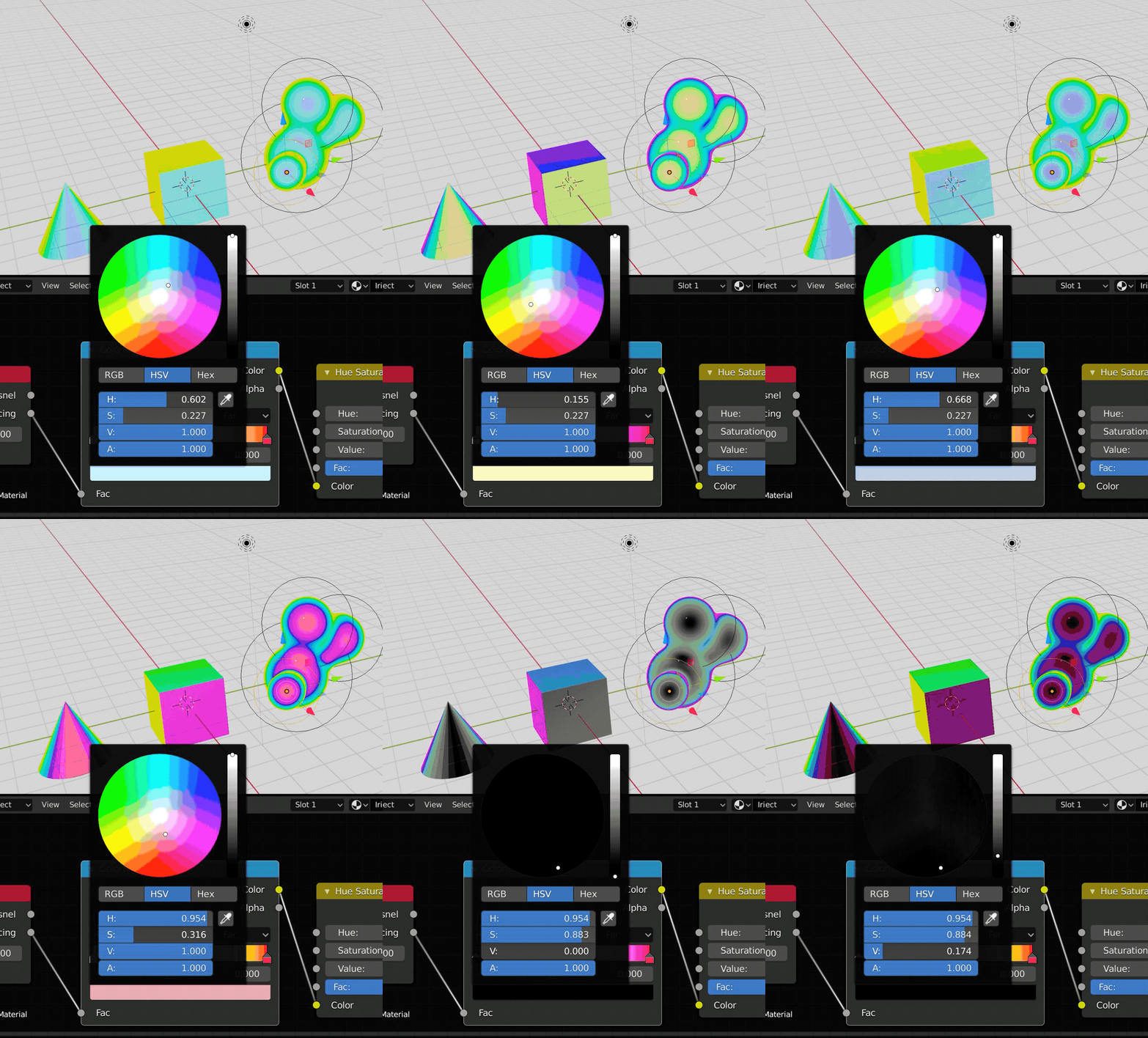
There's some image compression on this image, so the colour wheel is a bit wack, but you can look at where the selector dot moves as I tweak the H, S, and V values....

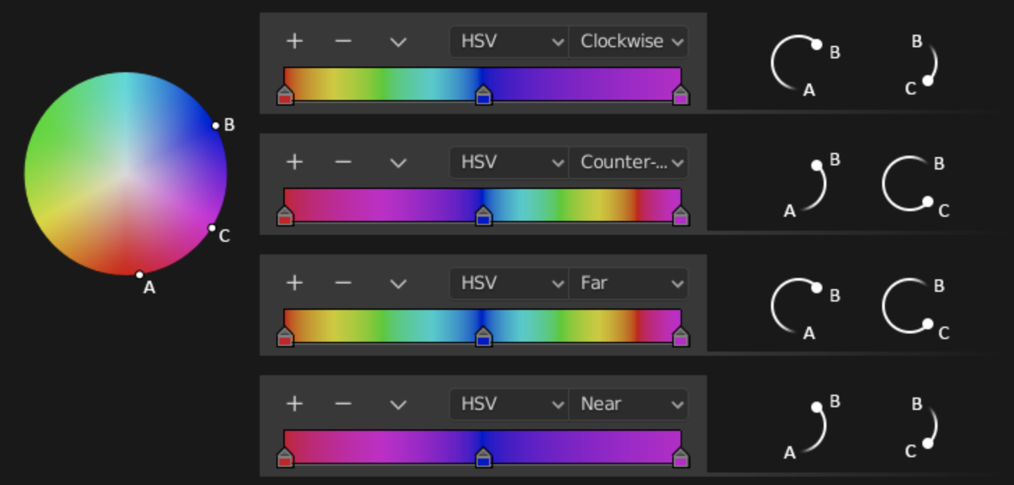
In Blender there's the handy color ramp which is meant to map the values of your colour into a gradient. You just define the colours at the ends and then get Blender to calculate the gradient between the two (or more) colours. Now what I found was that you can ask it to map the colours around the wheel either clockwise, counter-clockwise, and also either via the nearest route (when you want complementary colours) or the furthest route around the entire wheel, thus achieving that distinctive "iridescent" look which is very similar to what humans are able to perceive.


When you change the H(ue) value, your selector goes around in a circle. When you change the S(aturation) value, the selector goes from the centre outwards or inwards. As for V(alue), it goes from light to black. Compare this with the rather confusing mixture of red green and blue to that goes into any colour under the rgb color space.

To be honest, I'm not 100% sure this is the final colour I am going for, it still feels like an experiment. Anyway, I'm going to try to make a couple more things like this in the coming month; hopefully I can make a few interesting looking prints on the metallic pearl paper...

Excerpt from Rochor Dream:


Coming soon on Plural Magazine's 100 Artists!

Monday, 15 June 2020

New motherhood is like a trip to a foreign country: Flatlands


Here's a recent visual experiment that I made in the stolen moments of Beano's naps. The setting is the 3-room rental flat we used to stay in, a very mundane 3-room "New Generation" (slab block) default template HDB flat built back in the 70s and 80s. And I think I've finally found a way to explain this thing that I've tried to explain many times before (but struggle to explain, similar to how its hard to explain my experience of taste-shape and mirror-touch synthesthesia).


For me, at any one time I always feel other superimpositions or juxtapositions of other places that feel a bit like memory palaces where I can store facts, thoughts, and memories of another time. Its hard to explain, but it is like when you have a work phone call, you might start doodling nonsense on a piece of paper. But in my case, when I start to daydream or let the mind wander (also: this happens when I am extremely focused on an urgent task and everything else zones out), I always end up recalling a visual memory of a place I've visited in the past. I am imagining tracing out its contours, I am imagining what the details must be like, what the lighting must be like. Honestly, I can't really explain why certain views for me just keep popping up as the 'memory palace', as some of the locations are pretty inconsequential and emotionally insignificant to me. Yet! My mind returns to them for further rumination. To what end? I do not know.

I began writing the following some time back when Beano was a much smaller baby. But now that we are all locked down at home for the corona, and I haven't left the house and its vicinity in days, fleeting memories of parks I've walked in come to mind. I found myself scrubbing through these albums trying to find the name of a particular memory that may as well be a dream. There was something oddly compelling about these images I had taken of my walks and frustratingly I COULD NOT FIND THAT ONE IMAGE OF THAT ONE WALK IN MY MIND. And turns out some of these images are pretty weird. Why are there no people in them?

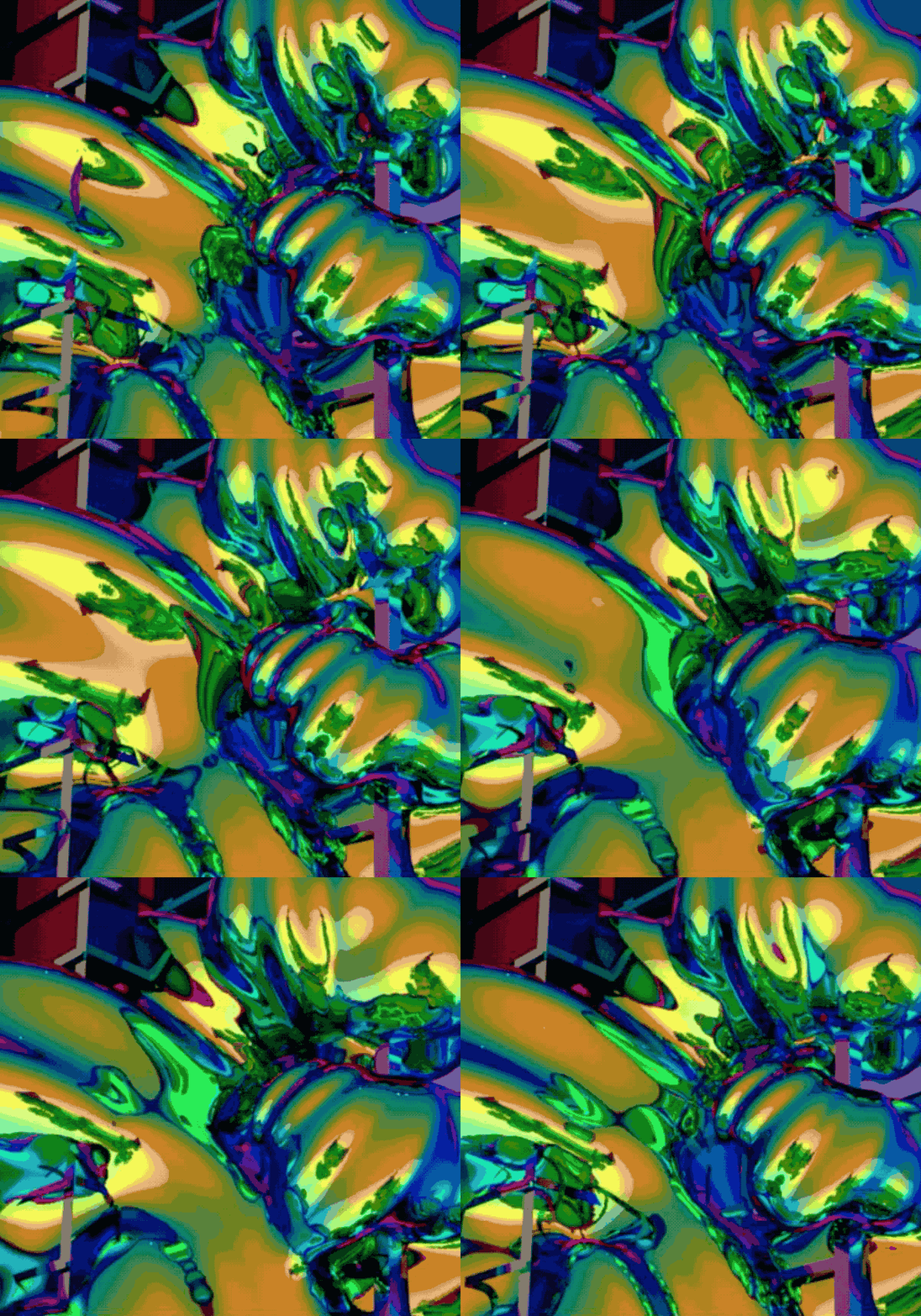
It was always in the back of my mind to do something with this huge lot of photographs, so.... now they have ended up in this visual experiment. I actually think it looks better than I expected it; so I think I might even make more of them soon...


New motherhood is like a trip to a foreign country. Firstly, the middle of the night feedings are conducted in near-darkness, with the endless droning of the white noise machine in the background, and some random show on Netflix playing to sustain your consciousness beyond all normal hours lest you fall asleep on the sofa and baby accidentally rolls off; not unlike when one takes a plane and night-time is arbitrarily enforced upon you, the sound of the engines whirring is ubiquitous, and all you've got to watch are some random blockbusters or episodes of Big Bang Theory on the inflight.

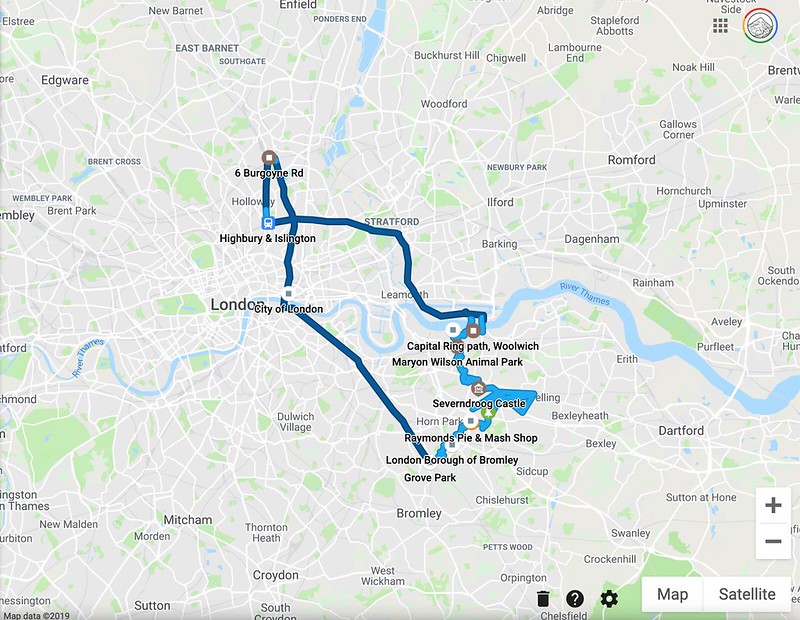
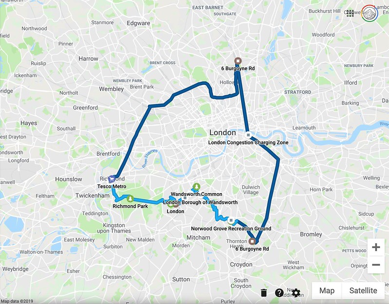
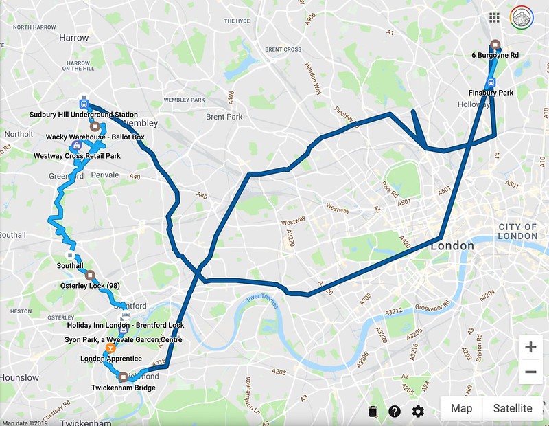
When Beano was very very small, I found myself trying to claw back a sense of mobility through a series of ever increasingly longer walks with Beano strapped to me. In some ways, this strategy reminds of me of the Capital Ring walk I did in 2017. Living in Greater London makes one feel crushed by one's own insignificance in a big city that is too vast to know by foot, so I thought I'd try to complete a ring around the city.

Once upon a time I was going to do a detailed expository blog post for each leg but AINT NOBODY GOT TIME FOR THAT so here are quite simply the photo albums for each leg of the walk...

Debbie's 2017 Capital Ring Walk!

The source material for "Flatlands"

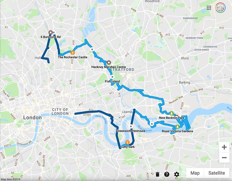
"I decided to walk the supposedly 78 mile Capital Ring over 6 consecutive days. I say "supposedly", for Debbie does not go "as the crow flies" but rather haphazardly in a squiggly line all over the map, and according to other mapping devices it seems I may have walked more than 150 miles in total. Rather than starting with the traditional route as listed in TFL's maps and David Sharp's guide book to the Capital Ring, I decided to start and end my journey at Stoke Newington's Rochester Castle."

14 March 2017: CAPITAL RING Stoke Newington to Woolwich

Day 1: Stoke Newington to Hackney Wick
Day 1: Hackney Wick to Beckton District Park
Day 1: Beckton District Park to Woolwich Foot Tunnel

15 March: CAPITAL RING

Day 2: Woolwich Foot Tunnel to Falconwood
Day 2: Falconwood to Grove Park

16 March 2017: CAPITAL RING

Day 3: Grove Park to Crystal Palace
Day 3: Crystal Palace to Streatham Common

17 March 2017: CAPITAL RING

Day 4: Streatham Common to Wimbledon Park
Day 4: Wimbledon Park to Richmond

18 March 2017: Capital Ring

Day 5: Richmond to Osterley Lock
Day 5: Osterley Lock to Greenford
Day 5: Greenford to South Kenton

19 March 2017: CAPITAL RING

Day 6: South Kenton to Hendon Park
Day 6: Hendon Park to Highgate
Day 6: Highgate to Stoke Newington

Sunday, 7 June 2020

A Glorious Bale of Virtual Hay: Second Life worlds and their visual references


My Second Life Avatar is now approaching its teens! Monster Eel is 13!?... (and Monster wasn't even my first character). Every few years when I return to Second Life I'm delighted to find that it has its own life, going on strong. Things are even more detailed now. Who is doing all this? Who is paying for people to do this? Is it all just a passion project for people? Why does this unnecessarily detailed digital bale of hay exist? There's a whole cottage industry of people making exquisite virtual hairpieces and billowing blouses and freckled skin and distressed furniture and plants and antiques and futuristic gizmos for sale (sometimes dispensed via some unnecessarily complicated gacha machines)!

Over the weekend Beano decided to have a long nap whilst strapped to me (WOW!!!!) so Mummy went on to Second Life to have an adventure without leaving home... and also to look at the types of interactions in these 'installations'. If we think about the references that each of these worlds draw upon, I realised that the places I visited could be divided into 6 different categories....

1. Depicts an abstract world
Betty Tureaud's Rooms
- https://secondlife.com/destination/rooms-by-betty-tureaud

2. Replicates real world and has specific references
Paris for Ara
- http://maps.secondlife.com/secondlife/Simpson%20Bay/114/79/27

3. Replicates real world but has no specific reference
Breath of Nature (Serena Falls)
- http://maps.secondlife.com/secondlife/Serena%20Falls/28/82/22

4. Depicts a fictional world and with specific references to fictional works
Kintsugi
- http://maps.secondlife.com/secondlife/Runaway/71/123/23

5. Depicts a fictional world with some realistic elements set in the past
Puddlechurch Rye
- http://maps.secondlife.com/secondlife/Puddlechurch%20Rye/128/182/44

6. Depicts a fictional world with some realistic elements set in the future
Planet Vanargand Outpost Fenrir & Solveig Village
- http://maps.secondlife.com/secondlife/Amazing%20Island/148/169/242

[Admittedly, I have been writing a lot of LESSON OBJECTIVES lately and this might be seeping into the above...]

The categories are not black and white, they blur into one another. Perhaps there are unknown references behind them all that I am not aware of. To what extent are these novel creations, or are they actually faithful copies of weirdly specific things in some specific world of the creators? I... really don't know. Will some of these mysterious anonymous SL creators ever reveal a bit more about their own design process...? Is it recorded somewhere in the world via the odd blogger webpage or flickr group, posted online under pseudonyms that I can find?


1. Depicts an abstract world
Betty Tureaud's Rooms
- https://secondlife.com/destination/rooms-by-betty-tureaud


This is like looking into a early 2000s book on Creative Coding, or Intro to Processing, or looking at a folder of three.js's webgl experiments. Experiments and snippets, I say, because these abstract rooms are more like raw snippets than actual stories or narratives or worlds to explore.

The iridescent rooms look empty but when you walk into the middle of the rooms (probably triggered by your avatar walking onto the slightly raised surface), this triggers different interactive animations. This reminds me of the SL in the days of yore, when interaction and realism were even more limited, so all you could write a LSL script to rezz up were a bunch of basic geometric forms that were randomly coloured whenever you entered a space, and for interaction you could move these about randomly (although to what end, this would be unclear). In fact, this is EXACTLY what happens in some of the rooms.


Whilst I love these rooms because they definitely look nothing like real life (and it seem to me that Betty Tureaud’s works over the years have been focused on creating abstract worlds that don’t exist in real life, peppered with statues of human forms), I still think that the interactions for these have come a bit as an afterthought, or isn’t as naturalistic or intuitive as it could be (based on current available technology in SL). Its just like how we don't use marquee or iframe or mouseover or flash anymore and javascript mouseovers and css transforms don't really impress anyone anymore. (It doesn't mean that I don't enjoy walking through the rooms though!)


2. Replicates real world and has specific references
Paris for Ara
- http://maps.secondlife.com/secondlife/Simpson%20Bay/114/79/27


Paris for Ara is a location in Simpson Bay labeled under photogenic spots, and boy is it photogenic. I'm betting that many a SL fashion shoot has been done here. Although it is supposed to be Paris, it looks a bit more like Carnaby Street in London than Paris per se with all the English signage mixed in, and with the prominent rainbow pride flags everywhere (yay!), parts of it also feel more like Soho. The vision for this is ostensibly to render a real world scene into Second Life.


Some of the details are crazy amazing even when you zoom in, like for example, these steaming hot beignets (french donut fritters) I found on a cafe table. I'm impressed!


A photogenic spot like this is probably quite universally understood and enjoyed by all, since it has a real world reference (even if its been fudged a bit by mixing elements from different countries, but you know, 'generic european city with street-side cafes and pubs'), and some of the buildings are even faithfully rendered in their interiors, so I would imagine these to be spots designed to be rented out to residents or for retail purposes. I walked into what I think was a cream cake shop and there were 3 floors of empty rooms above, overlooking the street. There was even a torch by the stair, because you might have that in the stairway of a real stairway in reality, but I didn't use it because I had set the environment to SUNRISE.


3. Replicates real world but has no specific reference
Breath of Nature (Serena Falls)
- http://maps.secondlife.com/secondlife/Serena%20Falls/28/82/22


Next I visited another photogenic spot, Breath of Nature in Serena Falls. A beautiful flower meadow with pastoral elements rendered in loving detail - an endless sea of soft dandelions, a white horse, a windmill, an old farmhouse, some sheep, a rustic wagon... I know, people dig this shit. Can't go outside into nature? Well here's nature for you in Second Life. Oh and with some generic amercian top 40 alt rock country pop internet streaming radio channel playing by default in this SIM... as always. I've always wondered if this is the soundtrack by which the creators of these objects live by. Once in a while a SIM has good radio tastes, but most of the time, its just this not-very-interesting generic internet radio streaming through wherever I go, punctuated by the sound of my avatar thudding against things by mistake (THUNK THUNK THUNK THUNK).


There are some gems here though. A bale of hay with an ingenious way of seeming real. I know, these tropes of construction must have been devised years ago, and I admit I have never been deeply involved in building things in SL (and more of a tourist in SL), but there are some cool tricks to be found here. Its not hair particles which gives our hay bale its realistic appearance, it is a few strategically placed strands which do the trick.


I’m all like, who decided to build this in such detail? How many hours did it take? For them to construct the chicken coop with its wires, its distressed wood texture, to decide on its form. Is it a person with a chicken coop just like this? Did they HAVE to design a chicken coop first or did they use a reference from somewhere? I mean, this is not even a normal chicken coop. Its a set of shabby chic drawers converted into chicken coop. With a pile of rustic bricks by its side.


Finally, this bucket of ducklings with a duck about to jump into the water with mother duck looking on. This item even chirps. Yes, the ducklings, they are chirping. The water is cleverly done with just a partially transparent alpha layer on top with a translucent white pattern that makes it look like a reflection on water (not a true reflection of anything, but it doesn't have to be in order to look real enough from a distance!)


4. Depicts a fictional world and with specific references to fictional works
Kintsugi
- http://maps.secondlife.com/secondlife/Runaway/71/123/23

This parcel is named Kintsugi (the japanese term for repairing cracked pottery with gold) but really it is a tribute to Studio Ghibli's Spirited Away, which I will confess that I can no longer remember the story line for. It is supposedly based on the fictional world in the anime, and this plot relies a lot on notecards and the chat system to distribute information about the world to the user. Personally, I am not so much a fan of notecards, even though I like words - because all these notecards fall into my inventory and become a big mess over time.


A magical house on an island....


A series of red torii shrine gates... because why not, if you already have made one beautiful torii gate?


The water isn't really Second Life water, but some other object which has these obviously faked water ripples on them which look realistic from a distance but then when close up, start to look very artificial. You can walk on the water, which I think is the point of this magical world (in most of SL, you can walk into the water and ocean and even have a rather long walk into the ocean although it might be quite boring).


The mist and atmosphere is nice, but once again, like with any role play environment, the reverie of being in a mystical forest is sometimes punctuated by other SL residents walking by. Yeah one thing I don't get is why there are so many SL residents dressed as ladies with big bosoms and big hair and big butt in a tight dress...


5. Depicts a fictional world with some realistic elements set in the past
Puddlechurch Rye
- http://maps.secondlife.com/secondlife/Puddlechurch%20Rye/128/182/44


Another photogenic spot, Puddlechurch Rye is an event space which is reminiscent of a warehouse space, dressed up as a 1920s parisan speakeasy cigar lounge with plush carpets, stacks of antique books, delicate chandeliers, a stage for performances, and a gallery space. Reminds me a bit of when I visited the Museum of Everything in Paris (a travelling museum for artwork by outsider artists).


How much of a world like this is actually created entirely from scratch by one person (or a small team of people)? How many man hours goes into designing a world like this? Or, is this in part a very clever curation of well chosen objects from different creators to paint for us this speakeasy ambience?


What’s interesting is the detail to which the exhibition has been set with draperies, with conventional framing and unconventional framing. Can't do a real world exhibition? Well this is pretty close, although the artwork is also the world which has been rendered for us in such detail.


An exhibition space for flat 2D artwork, shown in several different ways...


Conventionally framed artworks...


Along with some unconventional framing...


And finally, some moving louvres to display 2D artwork. Not entirely interactive, but some ideas here on different ways to present a work in a virtual space...


6. Depicts a fictional world with some realistic elements set in the future
Planet Vanargand Outpost Fenrir & Solveig Village
- http://maps.secondlife.com/secondlife/Amazing%20Island/148/169/242


The thumbnail for this outpost on the SL destinations board was a huge "alien" mountain. But really, mountains are just boring old mountains like the ones on earth unless you say... ITS A SPACE BASE FROM THE FUTURE and here's a space outpost to go with it! I landed in this space outpost floating in the sky (no biggie, not a hard thing to build) and immediately was overrun by other residents rezzing on top of me, skimpily dressed ladies dressed in tight dresses and high heels running around over small old me. Yeah so much for the scifi vibes...


I enjoyed walking around this space base until I went through a door which said "NO ENTRY" which I assumed was written specifically to entice me to enter anyway. A few metres further down they must have not finished building the space station because I hilariously walked into a big hole in the floor, immediately falling about 3000 metres down back to ground, landing noisily on a giant geodesic dome...


Finally I found myself in an empty carpark in this alien world admiring the detail of the snowflakes blowing past me. No detail has been spared! The snowflakes are not just circles, they are images of SNOWFLAKES.


At this point Beano woke up so I had to terminate my adventures in SL...


Why haven't I made an 'art' project on Second Life before?

Last year Linden Endowment for the Arts closed. For many years now I have always wondered if I should apply for the land grants in the past, but I never got around to it because Second Life was something I enjoyed as a game, exploring without a specific goal. It simply wasn't high on my priority, since it requires quite an investment of time to build this all, and I've got a lot of real world projects to finish. Second Life was leisure and enjoyment for me, not work, the same way one might enjoy a pleasant walk through nature without the desire to reshape it all. I suppose if you were just dabbling and not too sure on whether you would commit to building such a project, it might have been useful to give you a nudge to go and do it without any financial startup cost. Land tiers aren't cheap after all. And if this is not art per se, then, is this all a 'vanity' project?...

However, the closing of LEA is not as much a loss as one might expect. I suppose if I am really motivated to create art in SL, I would continue to make it regardless of whether I had a land grant or not, and even with the closing of LEA, there continues to be lots of art on SL. To be honest I never really got into the community for SL artists. Besides a run in with some people in Singapore building an amazing Sikh temple several years ago (what happened to it I wonder?) I don't know what happened to other SL makers in Singapore.... Or maybe if you are out there, give me a holla...?