
Recently I've enjoyed just playing around in Blender with colour. There are three ways of declaring colors in blender - hex, rgb and hsv - very similar to CSS/HTML where you declare colour in hex, rgb and hsl. In a way its easier to use HSV or HSL because the model is based on the colours themselves but from each colour you can also change saturation and lightness, so it is a lot easier to pick and compare based on how close a colour is to another.
You can’t possibly do that from just eyeballing the RGB values or worse still the hex code for a colour (hex being the more compact form and thus less human readable way of declaring RGB values). So in a way HSL/HSV is a bit more designer friendly. Most young designers don't really delve that far into digital colour or colour spaces, and it seems more to be a thing that would concern programmers and developers more, but I wanted to get an iridescent colour-shifting hue, so the only way to get it is to look a bit closer at the way in which colour is picked.
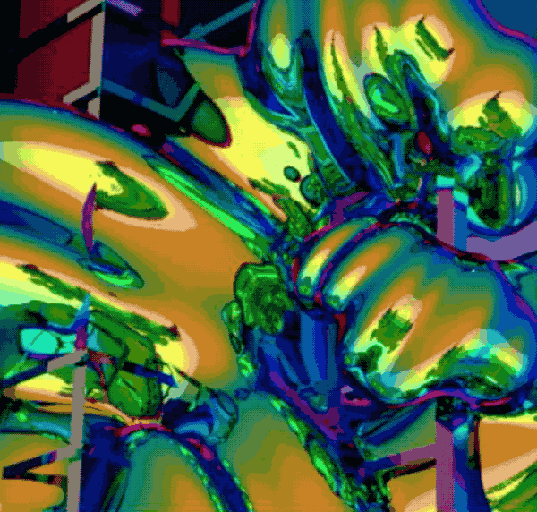
Iridescence is where the surface changes colour as the angle of view or angle of illumination changes.
HSL stands for hue, saturation, lightness, while HSV stands for hue, saturation, value. (Personally speaking, the HSV and HSL colour spaces look pretty much the same to me...)
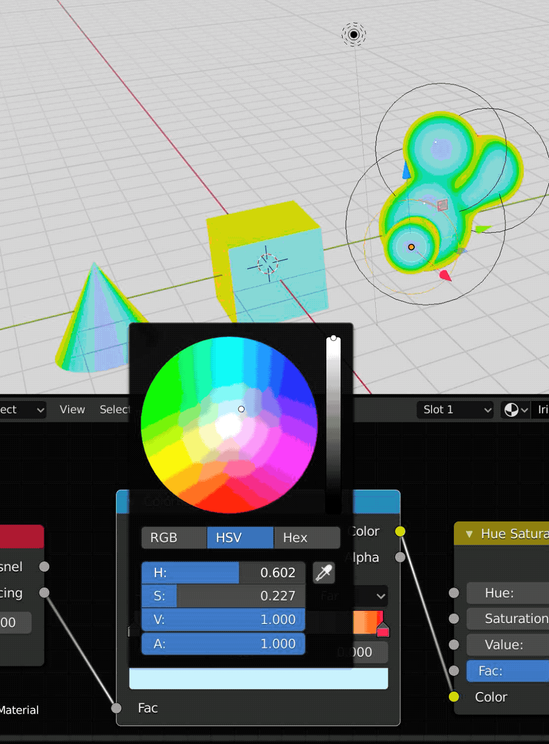
There's some image compression on this image, so the colour wheel is a bit wack, but you can look at where the selector dot moves as I tweak the H, S, and V values....
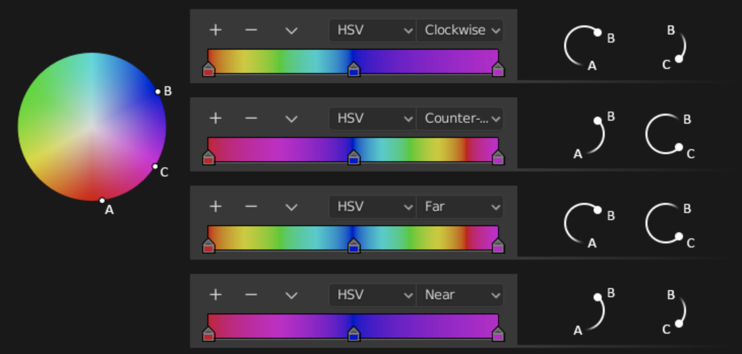
In Blender there's the handy color ramp which is meant to map the values of your colour into a gradient. You just define the colours at the ends and then get Blender to calculate the gradient between the two (or more) colours. Now what I found was that you can ask it to map the colours around the wheel either clockwise, counter-clockwise, and also either via the nearest route (when you want complementary colours) or the furthest route around the entire wheel, thus achieving that distinctive "iridescent" look which is very similar to what humans are able to perceive.
When you change the H(ue) value, your selector goes around in a circle. When you change the S(aturation) value, the selector goes from the centre outwards or inwards. As for V(alue), it goes from light to black. Compare this with the rather confusing mixture of red green and blue to that goes into any colour under the rgb color space.
To be honest, I'm not 100% sure this is the final colour I am going for, it still feels like an experiment. Anyway, I'm going to try to make a couple more things like this in the coming month; hopefully I can make a few interesting looking prints on the metallic pearl paper...
Coming soon on Plural Magazine's 100 Artists!
No comments:
Post a Comment